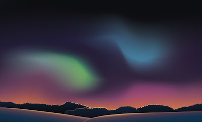
This story begins in Illustrator, where Andrea thought it would be a great idea to create a sky by going wild with the gradient mesh tool...
It makes a bit more sense with some snowy hills and trees:
So far this is all vectors, but I kept working in Photoshop to add some stars and textures.
See, I don't dislike this. It's quite pretty in its own, slightly mental right. I was going for this kind of super magical night sky kind of vibe, but it didn't work at all as a backdrop. I desaturated it a bit and tweaked the colours.
Better, but still not great. The stars and colours are just too much.
...and more...
...and it just ended up a bit weird. The good thing about vectors is that you can tweak things as much as you want. The bad thing with vectors is that you can tweak things as much as you want. :(
This worked a bit better, though:
Phew! I got there in the end...
Edit: forgot to post my little reference image sheet/moodboard! Here we go:


No comments:
Post a Comment